original publication date: 07.04.2024
Edited for clarity.
07.01.2024
Finally an update on actual hands-on progress!
First and foremost, I want to introduce the writing software I'm using, Obsidian. What I like about it is that the software works on top of plain Markdown files. This means that the content is not locked behind the software and I have the original version of the files in my computer. The files also makes them lightweight so I could share them easily. This aspect will become relevant when I back up the website in Github.
Anyways, here's a picture of what I got! Let's tear it apart, shall we?
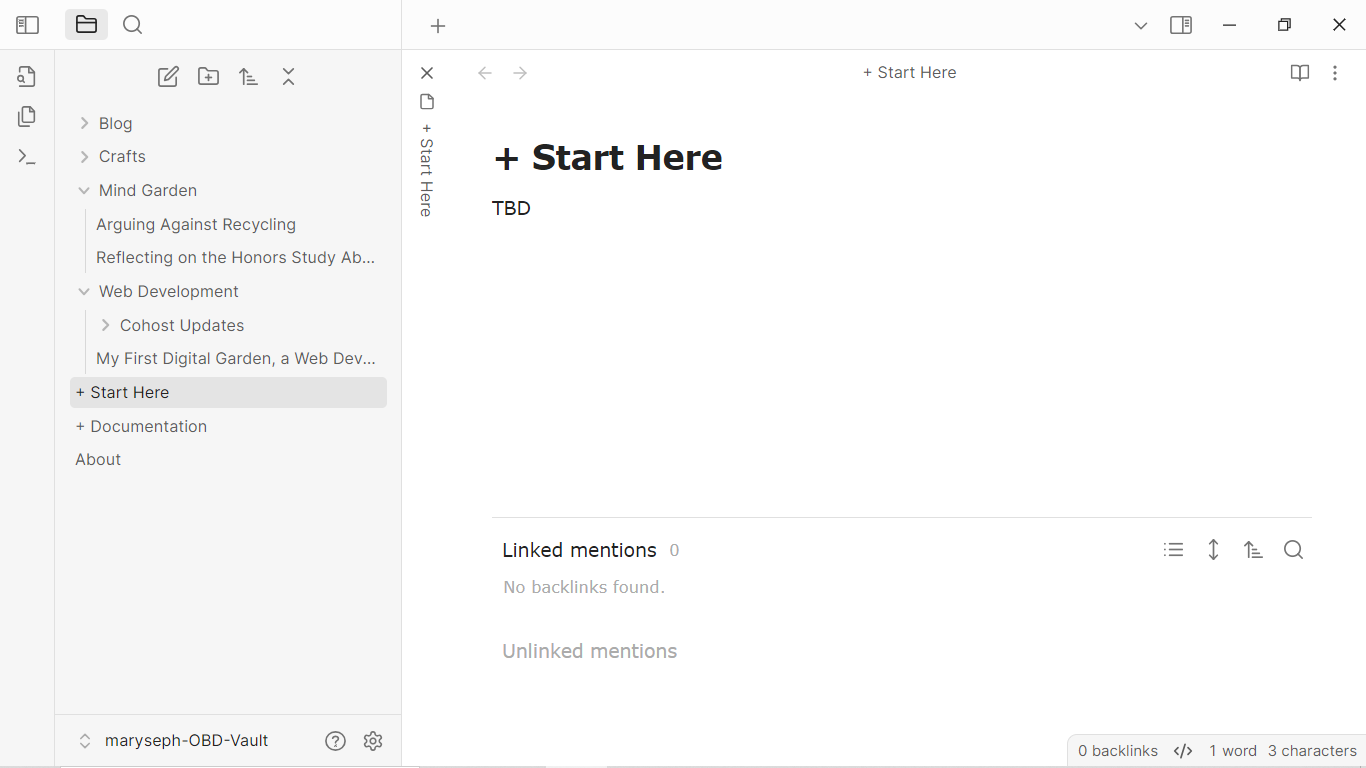
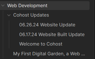
The left hand side bar shows the folder system, mirroring the structure of the website.
- Blog
- Crafts
- Mind Garden
- Web Development
For the initial deployment, I'm only going to make available the some of the content available. But I think I'm getting carried away. How did I even get to *this* point? Heck, when I started this vault, that's exactly what I was asking myself, haha. Let's go step by step.
-
Download and boot up Obsidian
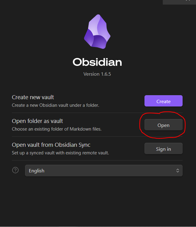
While OBD beginner tutorials would recommend the Create new option, because I have a established workspace (plugins, themes, shortcuts), I create a folder that will serve as the vault and paste the .obsidian folder from other vault (usually this one). So when I Open the vault, the software loads that data and I don't have to configure the workspace every time.
Side note: I will make available the specifics I'm using for my OBD vaults, particularly the main one. Digital gardens drafted here usually use less plugins and whatnot. Visualizations and structure is what matters. The simpler the vault and more readable it looks, the better for me. May be I should also make available the plugins I use for the digital gardens in OBD... It's pretty minimalistic so I think it's also beginner-friendly. You could really go crazy modifying the workspace. Oh, haven't I been there...
After loading up the empty vault (the
.obsidianfolder will not be visible), I created the folders that will also be displayed as a dropdown in the TiddlyWiki/Blink version.The two that I was sure of where Blog and Mind Garden Then, as usual I struggled with the structure and after fumbling around, I realized I should build the structure from the bottom up. In other words, I should let the content dictate the categories rather than the other way around.
Thus, I ended up throwing all the files that I felt like I wanted to present in the website which included the Web Development folder.
This is where all the content related to digital gardens and Cohost website updates will live.
The Crafts folder is something I thought at the spur of the moment. I have done a lot of craft projects, main crochet and I would love to share information about them (materials, links to patterns, and other metadata) for documentation purposes. Because I have a *lot* to go through, edit, and update, this content will be available in the far off future.
That's it for the current structure. So let's look inside some files!
I'll address the elephants in the room, + Start Here, + Documentation, and About. The first is the homepage. As you can see, it's empty. Then, as the tin says, the documentation file will hold information about the creation of the website. Now that I think about it, maybe... nah, I think in this file I will condense the information in these updates and link back accordingly. This file was created to follow the process of my previous digital garden.
As I keep mentioning this mind garden in pretty much every update, I finally began the process to upload an in-depth video about it. It's a project presentation for a college course but because I knew I wanted to upload it to YouTube, I tried to not address the professor in particular. It should be available in the following days. I'll share a link on cohost when it's out.
Where were we? Files, yes.
-
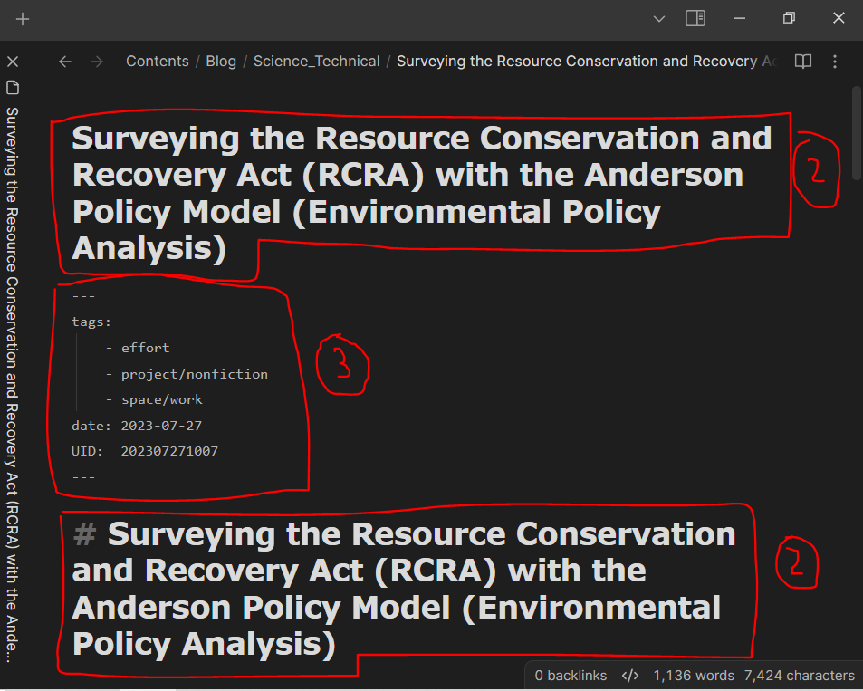
Why the heck is the title of this file repeated so many fricking times?! It's... a stylistic choice, and half the blame goes to the software. The official title of the title is reflected in the breadcrumb and the text directly below. What follows is the file's metadata (date and UID are the most important ones). The next title is inside the file. I can't explain why I like having the title inside the file as well. It looks good to me. But here in Obsidian, long titles look MASSIVE. I could delete the title of course. Heck, I have to delete it when I import the file to TiddlyWiki/Blink for the same visual reasons as here. Maybe I will. Maybe I should... I'll let you know if I do.
-
The metadata is kinda there at the moment. I removed some properties that were irrelevant to the vault. It reminds me of Soren Bjorstad Zettelkasten's metadata (created time and updated time). I want my tiddlers to look like that tooooo...
All in all, I need to clean up the files before importing them to TiddlyWiki/Blink. I need to remove some metadata and obsolete bi-directional links, from navigation-related links to transclution-related ones. Some files are divided into section such as research papers and there isn't a plain text version of these files.
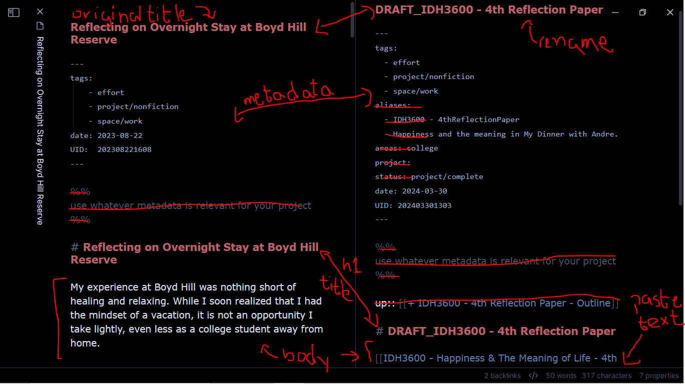
Last but not least, I leave you with an image that summarizes the cleanup process of these files.
